Combo Box
The Combo Box element is able to display a list of options where the end user can choose an option from the list. Each option usually holds an id or code value and a corresponding human readable description text. Modeling a Combo Box needs a binding of these up to three variables.
Example File (Builder project Advanced Modeling/UI):
 | <your example path>\Advanced Modeling\UI\uml\uiJavaScript.xml |
Combo Box Bindings
In this example we show bindings from a Combo Box to a <<UI>> controller and from a ListEntry message to the Combo Box. Of course, it is also possible to bind the other way round.
In the controller binding the variables selectedIndex, selectedText and the selectedValue are bound to the Combo Box by drawing usage dependencies between the Combo Box and the controller attributes. For the message binding we do the same using the attributes of the ListEntry class:
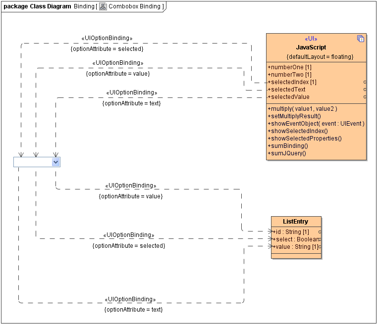
The binding is configured using the <<UIOptionBinding>> stereotype:
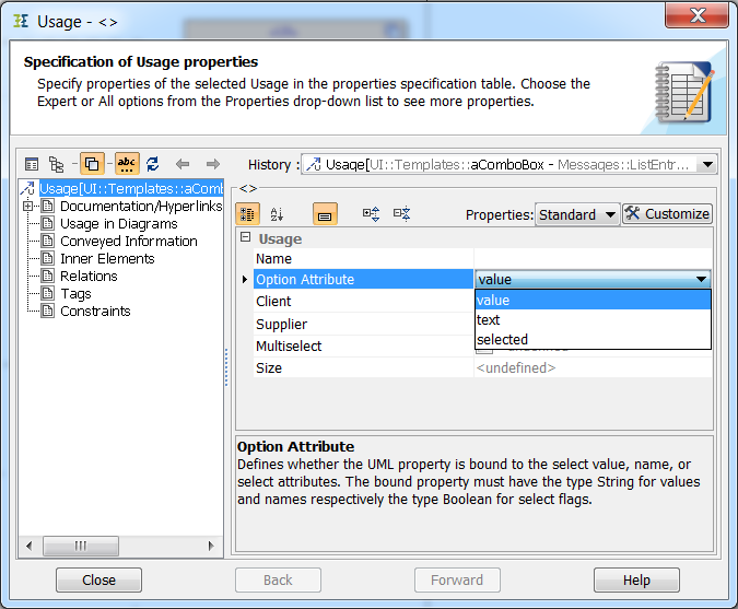
This stereotype holds tagged values to define which property of the Combo Box should be set:
| Option | Description |
|---|---|
| value | The value holds the options non-visible value. |
| text | The text attribute holds the visible human readable text for descriptive purpose. This is also the default binding. |
| selected | Defines if a specific option from the options list is selected. Possible values are true or false. |
If no stereotype is defined, the attribute value is bound to the text property of the Combo Box.
Related Pages:
Usage of the UI Widgets: