On this Page:
TO DO: Translate excerpts to English!
Note for authors: Please do not attach any pictures to this excerpt page! Upload all images you want to use in an excerpt to the page _BPaaS_images.
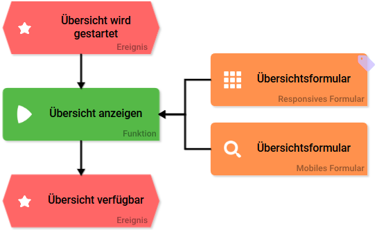
Starting BPaaS
The Content Area
delete_tile
To delete a tile from cockpit, please click on the Recycle Bin icon. Confirm Delete in the pop-up window.
create_tile
To create a new tile use the Sidebar Neue Elemente link.
create_tile_note
Modellers can create project, app and link tiles. App users are only authorized to create tiles and app tiles for external links.
Sidebar Additional Actions
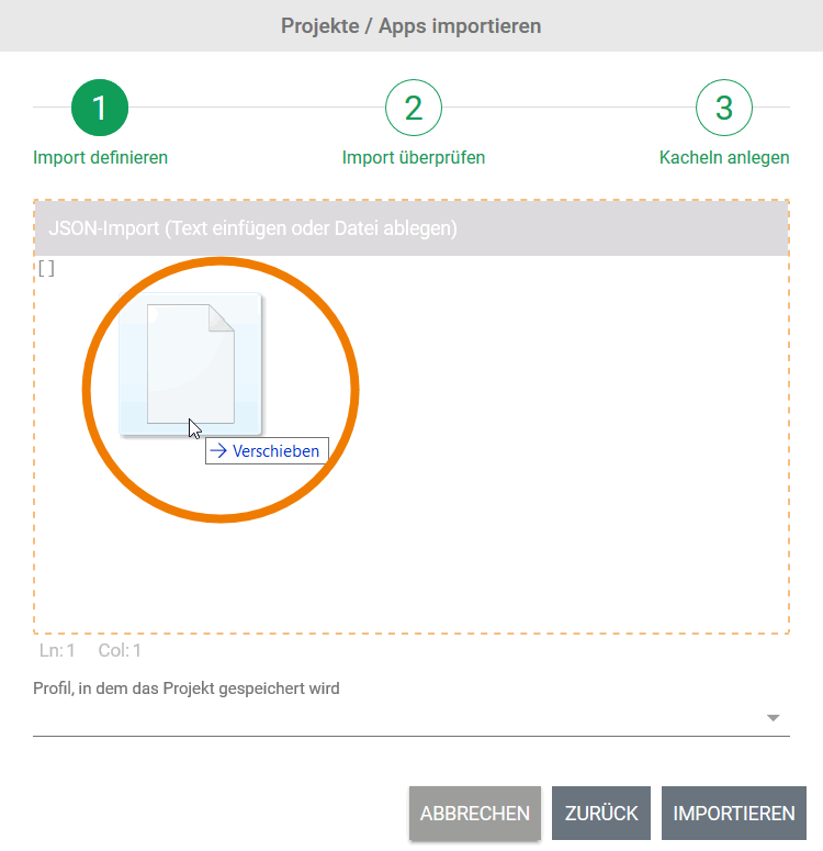
cockpit_import
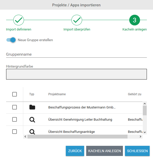
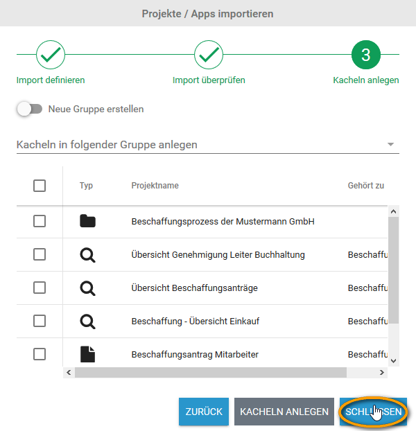
Exported apps or entire projects can be imported into the cockpit. There are two different options to add the to be imported project or app as JSON object to the JSON import window: Use UTF-8 coded files. Now define in which profile the import shall be saved. Use the drop-down menu to select a profile. If the chosen profile already contains models with the same name, then these will be listed alongside their element type and element name. If you wish to continue your import, then these elements will be overwritten with your import elements. To continue, please click the button OVERWRITE. To discontinue click CANCEL. To change the import object, choose BACK to return to step 1. In Schritt 3 können Sie entscheiden, ob im Cockpit direkt Kacheln für die importieren Modelle angelegt werden sollen. Im Cockpit können Kacheln für Projekte und Process Apps nur in einer Gruppe abgelegt werden. Wenn Sie Kacheln erstellen möchten, haben Sie daher zwei Optionen: Kacheln in einer neuen Gruppe anlegen Um die Kacheln in einer neuen Gruppe anzulegen muss der Schalter Neue Gruppe erstellen aktiviert sein. Sie können dann einen Namen für die neue Gruppe eingeben und eine Hintergrundfarbe auswählen (analog zu Die Navigationsleiste > Neue Gruppe hinzufügen). Wählen Sie im Anschluss aus der Liste die Elemente aus, für die Sie Kacheln erzeugen möchten. Schließen Sie den Vorgang ab, indem Sie den Button Kacheln anlegen anklicken. Kacheln in einer bestehenden Gruppe anlegen Sie können die Kacheln auch in einer Gruppe anlegen, die bereits im Cockpit vorhanden ist. Deaktivieren Sie dafür den Schalter Neue Gruppe erstellen. Öffnen Sie die Auswahlliste Kacheln in folgender Gruppe anlegen und wählen Sie eine der bestehenden Gruppen aus. Wählen Sie anschließend aus der Liste die Elemente aus, für die Sie Kacheln erzeugen möchten. Schließen Sie den Vorgang ab, indem Sie den Button Kacheln anlegen anklicken. Import abschließen ohne Anlage von Kacheln Wenn Sie den Import ohne die Anlage von Kacheln beenden möchten, klicken Sie auf Schließen. Wenn Sie zu einem späteren Zeitpunkt Kacheln für die importierten Elemente anlegen möchten, können Sie dies über die Sidebar Neue Elemente oder die Sidebar Hierarchie-Baum tun. Anlage von Kacheln nicht möglich Wenn die Import-Datei nur Process App Elemente enthält, für die die Eigenschaft Im Cockpit verbergen aktiviert wurde, kann Schritt 3 des Imports nicht ausgeführt werden. Das Importfenster zeigt dann eine entsprechende Meldung an. Auf der Seite Importierte Modelle verwenden erfahren Sie, wie Modellierer trotzdem Zugriff auf die importierten Modelle erhalten.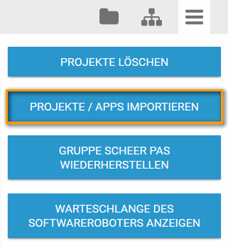
In the Sidebar Weitere Aktionen click on the button Import Projects/Apps. 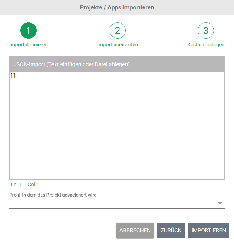
The import dialog opens in a separate pop-up window. Step 1: Define Import
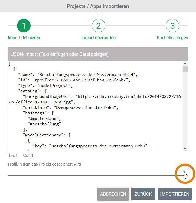
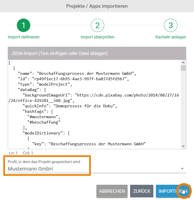
The Import Button only activates once import object and profile are entered. Step 2: Review Import
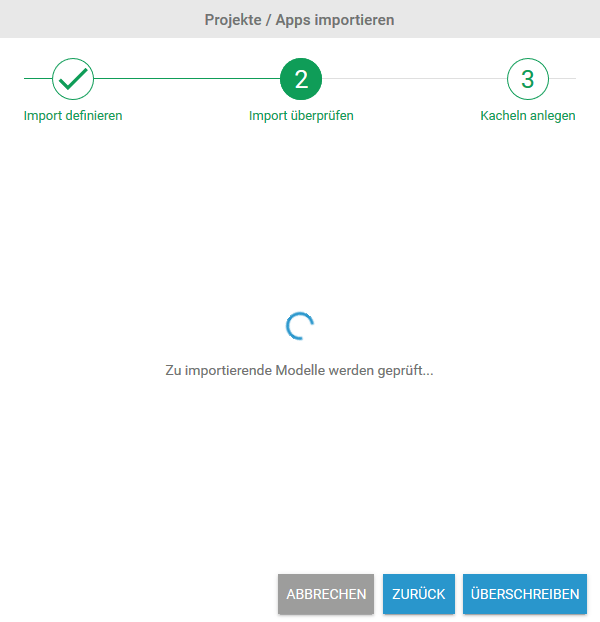
Once the import has started, all to be imported files will be initially analyzed to avoid duplicates. 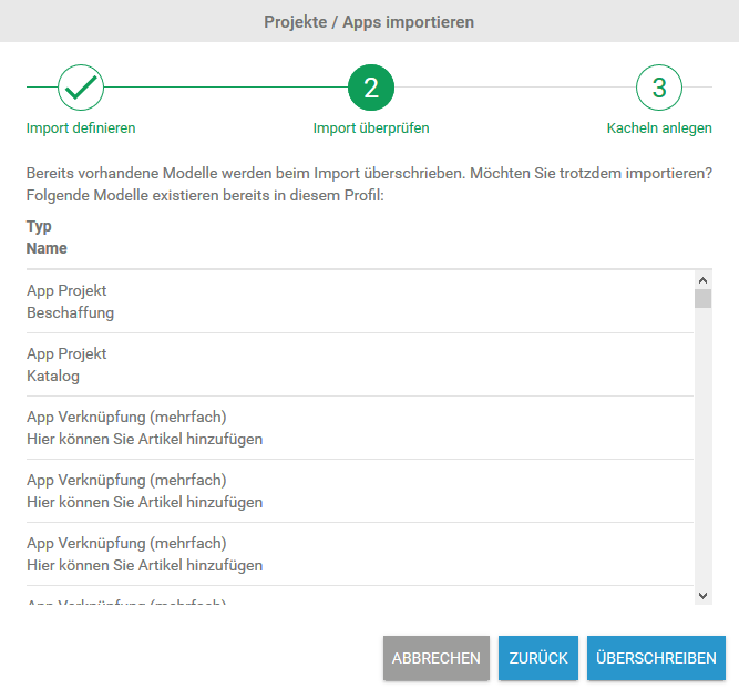
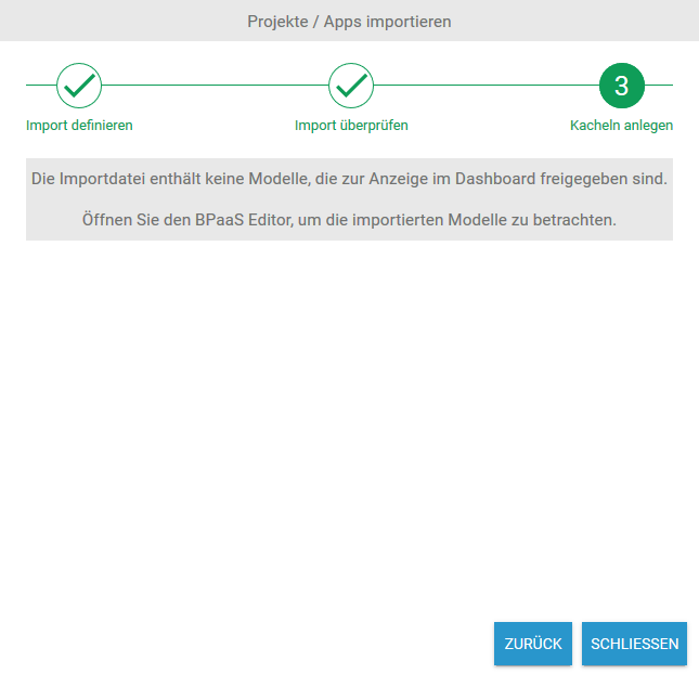
Step 3: Create Tiles
Werden keine vorhandenen Modelle gefunden oder haben Sie sich in Schritt 2 für Überschreiben entschieden, wird der Import durchgeführt. 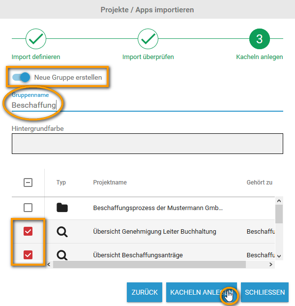
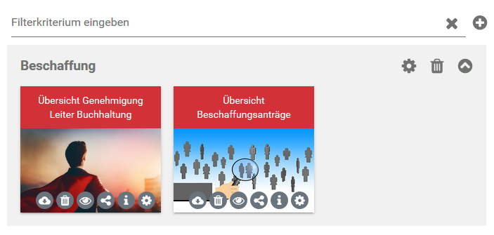
Die Kacheln für die ausgewählten Elemente werden im Cockpit in der neuen Gruppe angelegt. 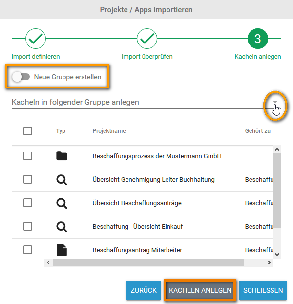
Browser Support
bpaas_supported_browser
Internet Explorer 11* Microsoft Edge 38 oder aktueller * Verwendung des Internet Explorers Verwenden Sie für die Nutzung von BPaaS 16.04 oder höher den Internet Explorer 11 oder seinen Nachfolger Edge, da der Support für den Internet Explorer 10 seitens Microsoft eingestellt wurde und BPaaS den IE10 nicht mehr unterstützt. Wenn Sie den Internet Explorer 11 verwenden, achten Sie bitte darauf, dass er im Modus Edge läuft. Wie Sie den Modus des Internet Explorers einstellen, erfahren Sie in unseren FAQ - BPaaS unter Technische Fragen > Die Benutzeroberfläche von BPaaS wird nicht korrekt angezeigt... . Es gibt eine Reihe weiterer Webbrowser, mit denen BPaaS aufgerufen werden kann, aber der Support der Scheer GmbH beschränkt sich auf die in der Tabelle gelisteten Browser.Anbieter Unterstützte Versionen Apple Safari 11 oder aktueller Google Chrome 60 oder aktueller Microsoft
Mozilla Firefox 52 ESR oder aktueller
Working with BPaaS Editor
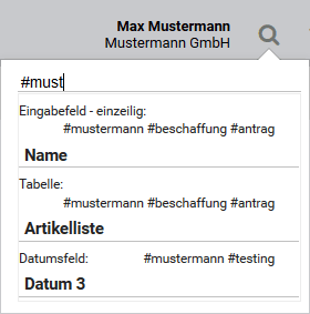
Searching in BPaaS Editor
search_maximum
Die Trefferliste zeigt maximal 15 Ergebnisse an. Ist das gesuchte Objekt nicht darunter, verfeinern Sie die Such-Eingabe. Gesucht wird nach mehreren Kriterien: Name, Übersetzung für die aktuelle Sprache, Objekttyp und Hashtag.
bpaas_search
Hilfreiche Tipps zur Verwendung der globalen Suche finden Sie auf der Seite Suchen im BPaaS-Editor.
Modeling Processes
pop-up_save
Use the SAVE button to save changes in a pop-up window. link_function
Avoid linking functions (reuse functions via the search or content menu, see EPK-Elemente kopieren und einfügen). Linked functions within an EPC or sub-EPC will lead to errors during process execution.
close_pop-up
Leave the pop-up window via the CLOSE button.
Caution: Changes will not be saved!
EPC Elements
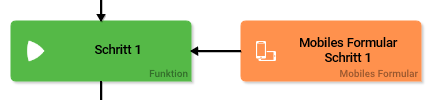
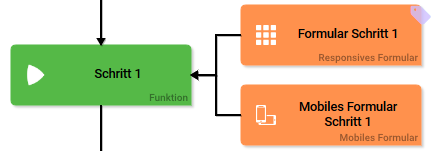
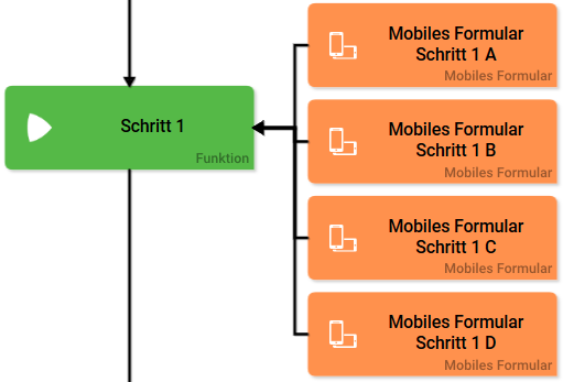
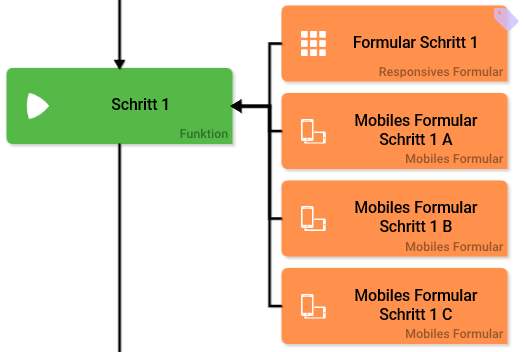
note_mobile_elements
Mobile elements can only be executed in Scheer PAS Mobile.
developer_options
| Open the Developer Options menu to use functions for advanced BPaaS design user. |

doubleclick_editor
Double click on the element to open editor.
sidebar_categories
The drop-down menu in the Sidebar New Elements will only show available elements to be created on this current editor tier.
Options in Edit Sidebar
epc_elements_css
CSS Modell
If layout specifications were defined in your own CSS model, please insert its name in this field. Your predefined design will then be in effect for this model.
epc_elements_execute
Execute
Use this button to start your model.
epc_elements_first_level
Elements, that are saved to the project editor work area cannot be tied together via connections.
epc_elements_app_start
Start
Use the start button or double click on the element to execute the process app.
epc_elements_activate_roles
Activate this option to verify during app execution if the user was assigned the necessary roles. For further information visit Berechtigungskonzept mit Rollen.
epc_elements_cockpit_hide
Hide elements in cockpit
If this checkbox is marked, then this element will not be shown in the cockpit sidebar and no tile creation is possible for this element in cockpit.
epc_elements_hide_mobile
Hide element in mobile app If this checkbox is marked, then this element will not be shown in the Scheer PAS Mobile app.
epc_elements_query
Search query In this search query you can define which information of an instance shall be searched for. Click on the gear wheel to open editor to save the search query as JSON object.
epc_elements_eye
This field uses auto-complete. Use the  icon to open the underlying EPC.
epc_elements_defining_app_project
If you define a model directly at the app element, then the model assigned to the app project will be ignored.
epc_elements_init_model
Initialization model The initialization model defines process steps that shall be completed prior to executing the app. The to be executed initialization model will be defined globally at the element App Projekt. If you have already configured an initialization model that shall be used for this precise entry link, please save its name here. This model will then be used prior to executing the elements.
epc_elements_execution_model
Execution model
The execution model is defined globally in the App Projekt element. If you configurated an EPC model, that shall be used with only this precise entry link, please save its name here.
epc_elements_admin_model
Administration model The administration model verifies that all users were assigned the necessary roles. The administration model is defined globally in the App Projekt element. If you configurated an administration model to used with only this precise entry link, please save its name here. DEPRECATED mit Version PAS 1.0 Deprecated with PAS 1.0: Do not use the administration model for role based apps but manage roles centrally via Scheer PAS Administration. For further information visit Berechtigungskonzept mit Rollen.
epc_elements_fieldname_rest
Fieldname in container Assign a name under which the server answer is saved to the container. If the fieldname in container remains empty, integration.result will be used.
epc_elements_show_favorites
Show favorites PAS 1.0 Activate this checkbox to show this entry link in Favoritenansicht of Scheer PAS Mobile App.
epc_elements_role_for_link
Role for link Insert the name of the role to receive app authorization here. The field Role for link is supported by auto-complete, which will list matching suggestions.
note_roles_in_apps
Keep in mind to always issue two roles! Each role must have a create and an overview element.
bpaas_collection_name
Collection name
All app data is saved in its own name space. In this field you can define sub-name spaces for the instances of this precise entry link in the data bank.
As soon as a collection's name is entered in the entry link, the instances of this link will no longer be saved at the same spot as the data of the remaining entry links of the project. We urgently recommend to use this option for trial only. Preferably define the name of the collection in the app project.
note_process_apps_until_17.2
css_template_blue
As a standard both the reference model and the overview model of newly created app projects are assigned the CSS template CSS blue.
css_templates
Template CSS blue Template CSS red Template CSS grey 
restifier_url_internal
If your SAP-Restifier is situated in a customer environment, do not forget to fill out the field URL (internal) in the System element.
volatile_data
Without further modeling the data is volatile, meaning they have been deposited in the container, but not saved! For further information see Instanzen speichern und löschen and Flüchtige Werte in die Datenbank speichern.
epc_elements_edit
Edit the element via Edit Sidebar.
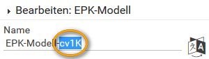
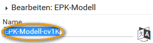
epc_elements_name
Name
Name of the element within modeling.
epc_elements_description
Description
A commentary field for the modeler. Its content is invisible to users and its sole purpose is internal documentation.
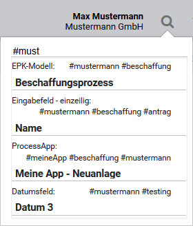
epc_elements_hashtags
Hashtags
Possibility to highlight with your own Hashtags. The leading hashtag sign # (hash) will be inserted automatically.
Use the spacebar to insert mulitple hashtags:

One hashtag may be issued for multiple elements:
epc_elements_mandatory
Mandatory
Marks the corresponding element as a requiered entry field.
epc_elements_save_instance
Save instance
Use this option to save instances to database.
epc_elements_connector_constraints
In order to prevent an EPC from being ineffective always verify event and counterevent when designating constraints.
Example: A form offers the answers YES and NO. In the process yes-answers shall follow a different path than no-answers. Therefore after sending the form, it has to be verified which of both paths needs to be followed. Instead of checking if YES or NO was specified, check if YES or NOT YES was entered. This is how you also pick up cases, in which neither answer was specified.
The counterevent to YES is not NO, but NOT YES!
logical_operators
Find an overview of commonly used logical operators below: Generally always use the strict (in-)equality operator. This is to ensure that two operands match not only in value but also by type.Operator Meaning == Equality operator != Inequality operator === Strict equality operator !== Strict inequality operator < Smaller-than-operator <= Smaller-than-or-equal-operator > Larger-than-operator >= Larger-than-or-equal-operator && Logical AND-operator. All connected logical expressions have to be fulfilled in order to comply with conditions. || Logical OR-operator. At least one of the connected logical expressions has to be fulfilled in order to comply with conditions. ! Logical NOT-operator. Reverses the logical value.
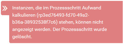
process_step_deleted
Caution when deleting process steps out of a (productive) EPC: Instances, which are situated in this process step can not be opened again afterwards. When trying to open an affected instance the following message will appear in the overview. This message contains name and ID of the deleted process step:
Executing Processes
Creating an App Project
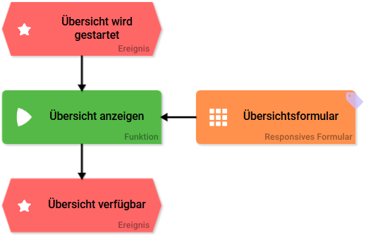
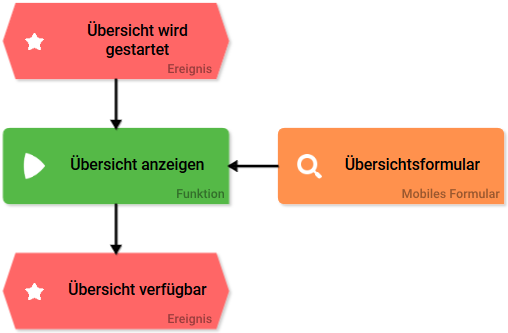
form_combinations
Forms always have to be attached to a function. When modeling an EPC you may use the following form combinations: Overview models should contain only a simple EPC with overview form. The following content is allowed:
The process step can be executed in a browser and on a mobile device. The Scheer PAS Mobile App must be available on the mobile device.
note_execution_model
Execution model If you previously created your own EPC model, which shall be the basis for executing the process app, please overwrite the entry in the field execution model. This field uses auto-complete.
note_init_model
Initialization model The same holds true for the initialization model. An Initialisierungsmodell is created when a process shall be executed prior to starting the process app. An example would be data retrieval from a separate system prior to starting process app to enable data access.
Form Elements
forms_table_config
Tables have to be configurated by the modeler. Please see Tabellenspalten konfigurieren to find out which configuration possibilities are available.
form_elements_edit_mode
To choose an option as default setting, click on to activate the form field's edit mode. After successful editing finish by clicking
  .
.form_elements_edit_mode_text
To insert a text as default click onto activate the form field's edit mode. After successful editing finish by clicking .gear_color
The color of the gear wheel shows, whether an element is empty (light grey) or if content has already been saved (dark grey).
forms_edit_sidebar
The form field may be edited via the edit sidebar.
form_elements_name
Name
Field name shown in the form.
form_elements_description
Description
The user sees the content of this commentary field in the form as a quick info:

form_elements_hashtags
Hashtags
Possibility to highlight your own key terms (Hashtags). The leading hashtag sign # (hash) will be inserted automatically.
Use the space bar to separate multiple hashtags:
One hashtag may be used for multiple form fields:
form_elements_additional_css_classes
Additional CSS classes
Possibility for a field acurate Layoutanpassung.
form_elements_current_value
Current value
This field can be used to insert default settings for the form element. The field current value contains a default value, which appears during form completion. If not overwritten by the user, this value will be transfered to the container while saving.
form_elements_possible_values
If in the field possible values a pair of values with same values was entered, i.e. 2;2 or ja;ja then one of these values will be deleted from the field display during saving. This value will be saved to the database as both value and label.
For more information please see Mögliche Werte: value und label.
form_elements_mandatory
Mandatory field
The marked element must be filled or used.
form_elements_read_only
Read only
This field is read-only.
form_elements_focus
Focus element
This field is ready for input and will be visually enhanced during form completion.
form_elements_show_name_in_field
Show name in field
The field identifier is shown within the field and can be overwritten.
form_elements_show_name
Show name If this option is activated, then the name of the element will appear in its top row.
form_elements_hide_input
Hide Input
Instead of the entered content only dots are visible. This functionality finds its primary use in password entry.
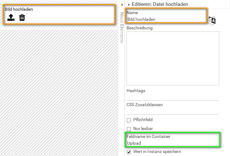
form_elements_fieldname_in_container
Field name in container
Defines the name under which the form field will be saved in the data container. If the field name in container remains empty, then the field identifier (name) will be used to save to container. If two form fields share the same field name in container, then both will access the same value.
The field name in container is a technical identifier. It is often used for extended coding. Therefore the field name in container should not contain any spaces, special characters or umlaut. For further information please visit Das Container-Prinzip.
form_elements_fieldname_for_possible_values
Container name for possible values
Possible values can not only be entered manually, one can also reference data objects from a container. In this case please enter the reference to the in container defined object into the field container name for possible values. The configuration field possible values remains empty.
form_elements_save_in_instance
Save value in instance
If this checkbox is marked, then the value entered in this field while completing the form will be saved to the databank.
button_close_form
Attention: All following function steps will no longer be executed, the process will stop at this position.
form_elements_execute_model
Execute model Option to insert a different EPC model from a current BPaaS project here.
form_elements_app_project
Process App Project
Insert the name of the app project here, which relates to the link. This field uses auto-complete and shows matching app projects in a recommendation list. If an app project was entered, then the corresponding model can be opend via the eye icon.
form_elements_table_standard
Standard size for table elements
Choose here how many rows the standard instance table shall show.
form_elements_column_config
Configurate columns Click on the gear wheel to open an editor, which enables editing the columns of the table. An overview of available options can be found here Tabellen manuell konfigurieren.
column_type_config
Configurate column type
This option allows you to define your own column types. You could replace actual values with other output values, for example with a picture in a column instead of a value from the container. To define when a set value is replaced by a defined value, conditions have to be defined. How to configurate a column type is described here Spaltentyp definieren.
form_elements_overview_new_tab
Open overview in a new tab If this option is activated, then with click on a search overview opens in a new browser tab.
form_elements_create_new_tab
Create in a new tab If this option is activated, then with click on  a new browser tab opens to create a new element.
form_elements_instance_new_tab
Instanz im neuen Tab öffnen If this option is activated, then a by click chosen instance is opened in a new browser tab.
tip_block_elements
It is recommended to only keep standard formatting in block elements. Define all individual changes such as font & font color for all headers in CSS instead.
applink_parent_child
child instance = instance in now opening app
parent instance = instance in currently open app
note_signature_scaling
Entry is centered midpoint. The more accurate the aspect ratio of the signature field corresponds to the drawing field, the larger the input will fill the field. The scaling of the aspect ratio of the field will vary depending on the terminal. Use the preview option to adapt the size of the signature field to your terminal.
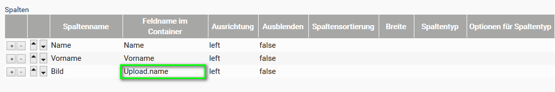
example_table_config_upload
Example: Search overview configuration to display uploaded data Next to name and given name the element upload file was inserted and named upload image. Upload was entered as field name in container. While configuring the search overview, add .name to the field name in container of the element upload image. When opening the search overview the name of the uploaded file (incl file format) is shown in the corresponding column picture as: Passbild Brigitte Beispiel.jpg.
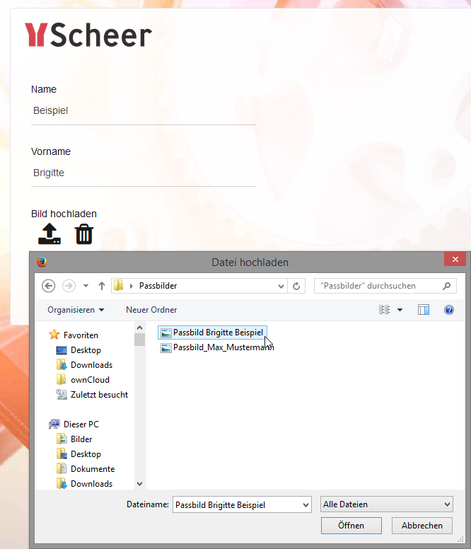
When completing the form the element upload image is used to upload the file Passbild Brigitte Beispiel. 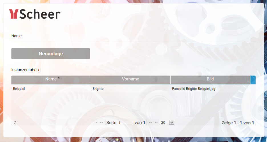
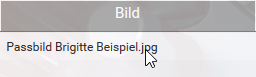
A click on the instance in the search overview... 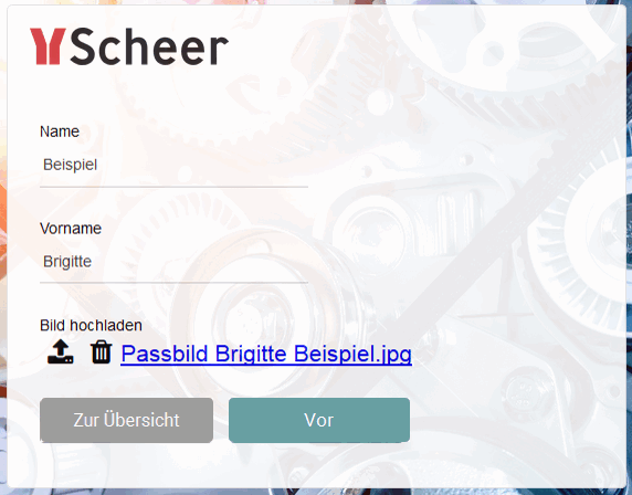
...opens the form. The element upload image was used to save the file. Therefore the link Passbild Brigitte Beispiel.jpg can now be used to download the corresponding file.
upload_element_instance_table
The element upload file enables upload of multiple files. This field's content is saved as array. Only one value per table field can be displayed in the search overview. If you wish to display the content of the form element upload file in the search overview, then it needs to be established during the search overview configuration which value out of the array shall be used. The array's first value is addressed with the number 0. Since it can be uncertain how many files were uploaded during multiple file upload, it is recommendable to always reference the first file. There are two options to view the content of the field: Example: Display of the first uploaded file in the search overview Three images were chosen for upload during completion of the form: The overview will always display the image, that was uploaded first Foto 1.jpg:
A form contains the upload file element upload image. Image was chosen as field name in container. In search overview two columns are defined. Both shall display the first image of the upload:
start_column_wizard
The button start column wizard opens the Spaltenwizard.
column_wizard_info
The column wizard is only available for instance tables.
column_wizard_disabled
The column wizard can only be used if the model was assigned to a process app. Otherwise the button remains inactive: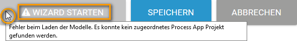
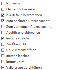
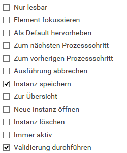
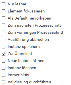
default_buttons_config
| Button | Activated Button Characteristics | Description |
|---|---|---|
 |
| Before The following default options have been assigned to the Before button:
One click on this button saves the form entries and progresses the instance to the next process step. If entry fields were provided with Validierungsausdrücken, then an additional check for entry validity is issued. |
 |
| Save The default setting for the Save button are:
Use of this button safes form entries. If entry fields were provided with Validierungsausdrücken, then an additional check for entry validity is issued. |
 |
| Overview The default setting for the Overview button are:
With a click on this button the user is transfered from the current form to the overview. Form entries will not be saved. |
delete_responsive_element
Important information regarding the deletion behavior of grouping elements: If you delete a grouping element it is erased including all content from your work space. While the grouping element will also be erased from your database, its content can still be found and used via the search function.
If the grouping element was linked prior to deleting, then only the current grouping element is erased. The linked element remains intact and can be found via the search function.
Creating Forms
uuid_note
Verwendungszweck der Spalte "uuid"
Each instance is assigned an UUID in the database to enable explicit identification. Instance tables contain a by default hidden column uuid. Unhide the column in order to show instance identification numbers. This information is needed for example when contacting BPaaS Support with a support request regarding faulty instances.
Authorization Concept with Roles
old_authorization_concept
The following usage description of roles is deprecated.
Starting with version PAS 1.0 we urgently recommend to create Apps mit zentraler Rollenverwaltung. Starting with version PAS 1.0 please only use the element Rolle.
Developer Guide
Exporting Instance Data
provide_export_template
Die Vorlage kann in einem Formular hochgeladen oder von einem Administrator direkt im System bereit gestellt werden.
execute_export
Das Coding muss für jedes Template individuell angepasst werden. Bei der Ausführung des Codes werden die Instanzdaten den entsprechenden Platzhaltern im Template zugewiesen und der Download der Datei veranlasst. Gerne helfen wir Ihnen bei der Umsetzung Ihrer Datenexporte. Wenn Sie die Exportfunktion von Scheer PAS BPaaS einsetzen möchten, wenden Sie sich an Ihren Scheer PAS Consultant.
FAQ
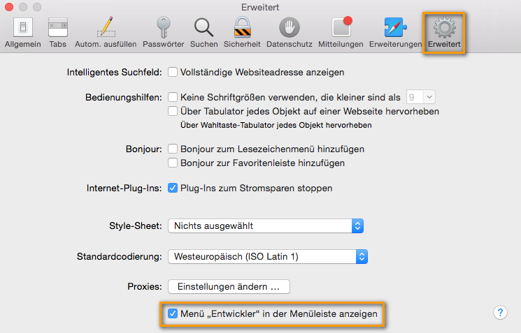
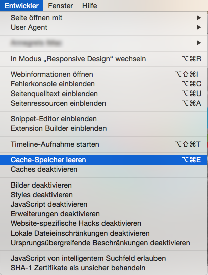
safari_developer_options
Öffnen Sie dafür im Menü Safari > Einstellungen und wechseln Sie hier zur Registerkarte Erweitert: Aktivieren Sie die Checkbox Menü "Entwickler" in der Menüleiste anzeigen: Die Option Entwickler wird in der Safari-Menüleiste hinzugefügt: Jetzt können Sie über das Entwicklermenü den Cache-Speicher leeren.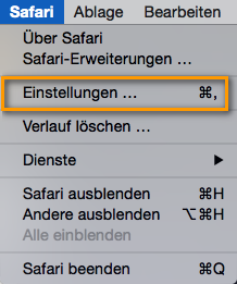

note_error_handling
Eine Übersicht über die BPaaS-Fehlermeldungen sowie Hinweise zu möglichen Ursachen und Lösungsansätzen finden Sie im Bereich BPaaS Support auf der Seite Fehlerbehandlung BPaaS.
General Information
note_authorization_concept
Additional information regarding creating role based apps can be found in the BPaaS Dokumentation on page Berechtigungskonzept mit Rollen.
metainfos_unchangeable
Meta information are not changeable. If you would like to display meta information in a form field you always need to activate read-only characteristic for the relevant fields. If the field remains editable and changes are made to the meta information, those entries will not be safed!
fileupload
Alternatively you may upload a file via the  icon ( BPaaS 17.3 ).
fileupload_image_format
Supported formats for image files are *.bpm, *.gif, *.jpeg, *.jpg, *.png und *.tiff.
overview_one_value_per_field
One field in the table in the search overview may only contain one value each.
note_element_name
Make sure to always name your elements. This name may not contain any of the following special characters: $ * + ? . ( ) [ ] { } / \ | ^
If the field Name remains empty or one of the characters listed above is used, then a corresponding warning will be issued.
editing_focus
Tip for working in BPaaS Editors
 | Use a single click to set focus to a field. |
 | Use a double click to mark the clicked word. |
 | Use a triple click to mark the entire field's content. |
form_test_mode
The testing possibilities of a form are limited within play mode. To test the interaction between multiple apps with the corresponding window management start the apps via tiles in Cockpit or via the Process App entry link in Project Editor.
timestamp
The date is saved in amount of milliseconds (long) since 01.01.1970. Dates that are further in the past are therefore marked with a negative sign.
authorization_check_during_saving
An authorization check will always be performed while saving.
close_does_not_save
Attention: Unsaved data will be lost when clicking Close.
cancel_does_not_save
Attention: Unsaved data will be lost when clicking Cancel!
synchronization
Please be aware that no synchronization will occur between simultaneously opened browser tabs and windows while working on models and forms. Changes made in one window/tab will not automatically appear in a second window/tab. In order to display changes made in a separate window/tab you need to reload your current page.
date_formats
The following place holders may be used to specify the date format: dd.mm.yy dd.mm.yyyy 31.01.2017 31.01.2017 m mm M MM month single-digit month double-digit month abreviated month written-out d.m.yy dd.mm.yy dd. M. yy d. MM yy 31.1.2017 31.01.2017 31. Jan. 2017 31. January 2017 d dd D DD day single-digit day double-digit week day abreviated week day written-out d.mm. yy dd. MM yy D dd.mm.yy DD, dd. MM yy 31.01. 2017 31. January 2017 So 31.01.2017 Tuesday, 31. January 2017 The place holders may be combined with a fill character, i.e. blank space, dot, comma, hyphen, horizontal line. Fill words are accepted as well. fill wordDate Format Place Holder Display Date Format Entry Display in Date Field
(example 31.01.2017)Year yy oder yyyy four-digit year figure Month Day Fill Character Date Format Entry Display in Date Field (example 31.01.2017) dot dd.mm.yy 31.01.2017 hyphen dd-mm-yy 31-02-2017 horizontal line yy/dd/mm 2017/31/01 blank space d. MM yy 31. January 2017 comma DD, d. MM yy Tuesday, 31. January 2017 DD, the dd. MM yy Tuesday, the 31. January 2017
Overview
Content Tools