Page History
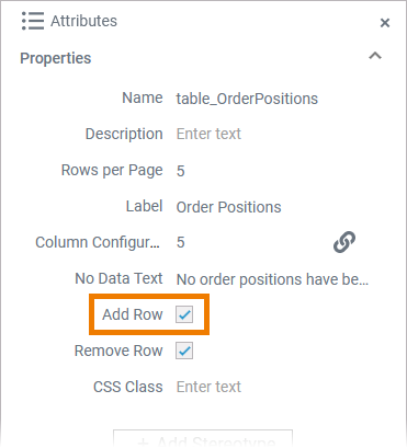
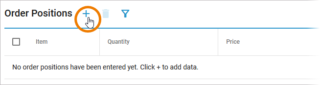
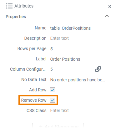
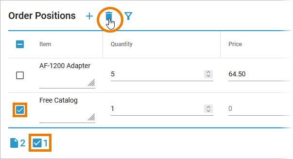
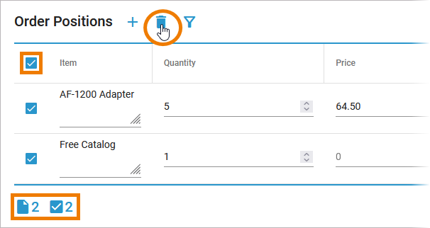
The data table element enables you to structure the information in a form. It is useful if the user needs to enter similar information several times, for example different positions in one order form. The data table offers a number of configuration options, so that you can adapt it to your needs. Depending on your choice in the table configuration, the executed table offers the user different functionalities.
| Multiexcerpt include | ||||||||
|---|---|---|---|---|---|---|---|---|
|
| Multiexcerpt include | ||||||
|---|---|---|---|---|---|---|
|
| Div | |||||||||||||||||||||||||||||||||||||||||||
|---|---|---|---|---|---|---|---|---|---|---|---|---|---|---|---|---|---|---|---|---|---|---|---|---|---|---|---|---|---|---|---|---|---|---|---|---|---|---|---|---|---|---|---|
| |||||||||||||||||||||||||||||||||||||||||||
|
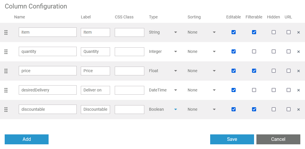
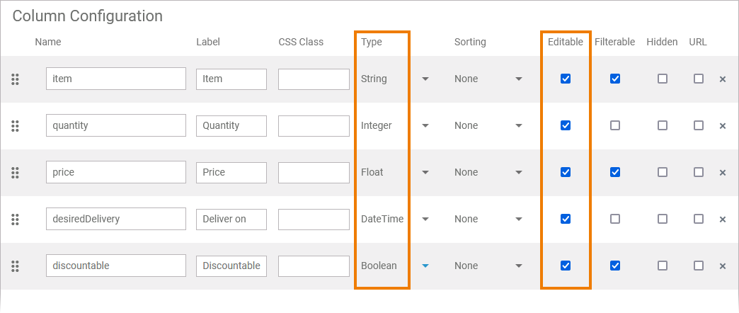
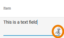
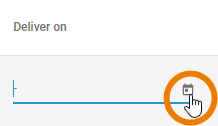
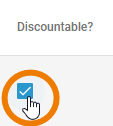
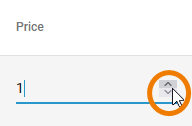
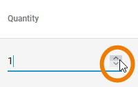
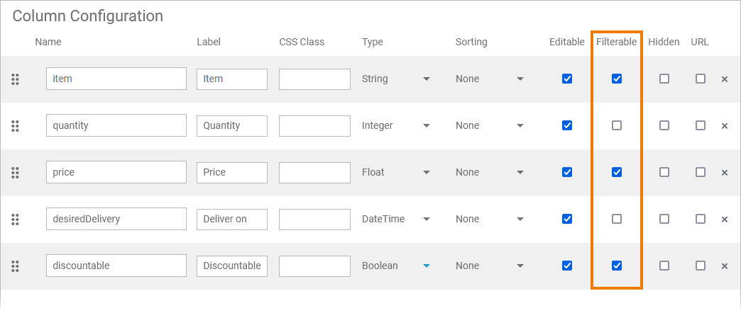
Editable Content and Content Type
| Div | ||||||||||||||||||||||||||||||
|---|---|---|---|---|---|---|---|---|---|---|---|---|---|---|---|---|---|---|---|---|---|---|---|---|---|---|---|---|---|---|
| ||||||||||||||||||||||||||||||
|
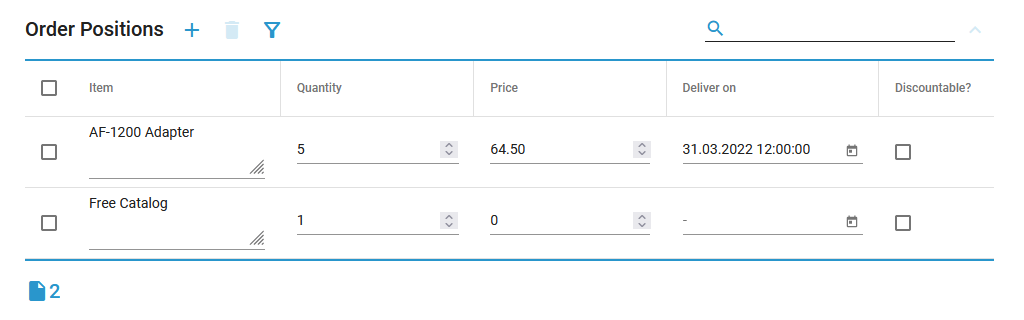
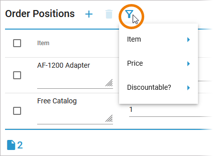
Filtering the Table Content
| Div | ||||||||||||
|---|---|---|---|---|---|---|---|---|---|---|---|---|
| ||||||||||||
|
Functionalities Available Only in the Executed Data Table
| Info |
|---|
The following functionalities are available by default in the executed data table and cannot be turned off via the table configuration. |
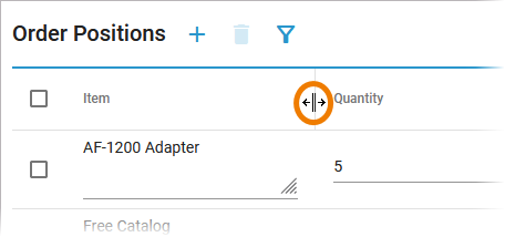
| You can resize the width of the columns of the data table with your mouse by drag and drop. |
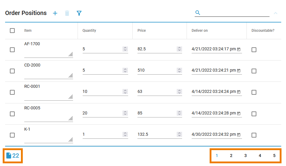
| The counter in the table footer shows the current count of table items. If the maximum row count is exceeded, a pagination is displayed. You can use it to navigate through the various table pages. |
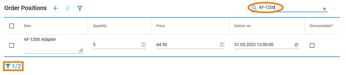
| Use the search field to apply a full-text search to the content of the data table. The number of hits is displayed in the table footer. |
| Otp | ||||
|---|---|---|---|---|
|
| Rp |
|---|
Overview
Content Tools