Page History
Toolbar
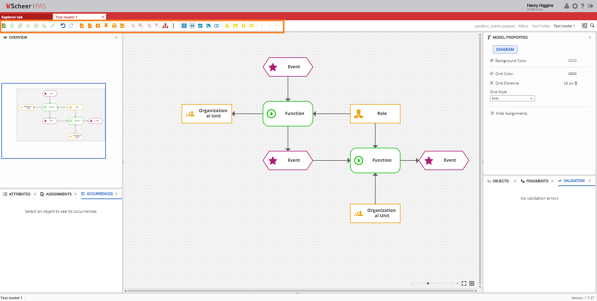
model overviewModel Overview
| The Explorer tab and the Model tab share the same toolbar and some of the options. The model specific options are explained in the following sections. |

Toolbar
buttonsButtons and
optionsOptions

The toolbar in the Model tab allows you to manipulate the model or its objects. The icons are functionally grouped for better orientation. A functional group is indicated by a color. Each icon displays its function by means of a small pop-up window (mouse over).
Basic
optionsOptions and
reportsReports

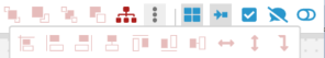
| The green icons in the toolbar represent basic options for models and objects: Add Model, Delete, Copy, Cut |

, Paste (Paste object, Paste object with new definition, Paste format), Compare model and Apply templates. The blue icons in the toolbar represent Undo and Redo options. In addition to these basic options there are also |
orange icons that represent: Export, Report, Share, Publish to Cockpit, Print model and Print model to |
Word (.docx). |
Object
alignmentAlignment

| The red icons in the toolbar are used for object alignment.
|
Model
optionsOptions

| The blue icons in the toolbar are used for manipulating a model with options like: Toggle grid on/off, Toggle Connection Drawing on/off, Viewer Mode, Show invalid, Tooltip or Toggle surrounding objects. |

Functional options
| ||
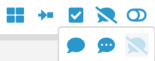
| The Tooltip icon has three options that show when you hover over it: Long tooltip, Short tooltip and No tooltip. |
Functional Options
|


The yellow icons in the toolbar are used for adding new elements to the model such as: Free text, |
Add image, Insert horizontal space, Insert vertical space or Fast Draw. |
Navigation
optionsOptions

| The orange icons are used for navigating through a model |

.
|
|
Show messages for model
| The Show messages for model icon in the toolbar is used when you want to open all messages related to a specific model . If there are no related messages to a specific model, this option will be grayed out.
|
Toggle role level visibility
| Turn on Toggle role level visibility button to see only the objects that are visible to your roll.
|

| Otp | ||
|---|---|---|
|
| Rp | ||||||||||||||
|---|---|---|---|---|---|---|---|---|---|---|---|---|---|---|
|
Overview
Content Tools