| Attribute Name | Description | Allowed Values? |
|---|
| Name Technical identifier for data processing and not visible for the end user.
| Alphanumercial characters and underscore. | Info |
|---|
It is not allowed to start the name with a number. |
| | | Multiexcerpt include |
|---|
| SpaceWithExcerpt | INTERNAL |
|---|
| MultiExcerptName | form_elements_name |
|---|
| PageWithExcerpt | INTERNAL:_designer_excerpts |
|---|
|
| | Multiexcerpt include |
|---|
| SpaceWithExcerpt | INTERNAL |
|---|
| MultiExcerptName | form_elements_name_value |
|---|
| DisableCaching | true |
|---|
| PageWithExcerpt | INTERNAL:_designer_excerpts |
|---|
|
|
| Description | | Multiexcerpt include |
|---|
| SpaceWithExcerpt | INTERNAL |
|---|
| MultiExcerptName | form_elements_description |
|---|
| PageWithExcerpt | INTERNAL:_designer_excerpts |
|---|
|
| Description | A commentary field for the developer. The content is invisible to users and its sole purpose is internal documentation. | Any string. |
| LabelField name shown in the form. | | Multiexcerpt include |
|---|
| SpaceWithExcerpt | INTERNAL |
|---|
| MultiExcerptName | form_elements_label |
|---|
| PageWithExcerpt | INTERNAL:_designer_excerpts |
|---|
|
| Any string. |
| Mandatory | The element must be filled or used if the checkbox is activated. | true | Element must be filled. |
| false | Element may remain empty (default). |
| Read-only | This field is write-protected. | true | User cannot enter values. |
| | Multiexcerpt include |
|---|
| SpaceWithExcerpt | INTERNAL |
|---|
| MultiExcerptName | form_elements_mandatory |
|---|
| PageWithExcerpt | INTERNAL:_designer_excerpts |
|---|
|
| true | | Multiexcerpt include |
|---|
| SpaceWithExcerpt | INTERNAL |
|---|
| MultiExcerptName | form_elements_mandatory_true |
|---|
| PageWithExcerpt | INTERNAL:_designer_excerpts |
|---|
|
|
| false | | Multiexcerpt include |
|---|
| SpaceWithExcerpt | INTERNAL |
|---|
| MultiExcerptName | form_elements_mandatory_false |
|---|
| PageWithExcerpt | INTERNAL:_designer_excerpts |
|---|
|
|
| Read-only | | Multiexcerpt include |
|---|
| SpaceWithExcerpt | INTERNAL |
|---|
| MultiExcerptName | form_elements_read-only |
|---|
| PageWithExcerpt | INTERNAL:_designer_excerpts |
|---|
|
| true | | Multiexcerpt include |
|---|
| SpaceWithExcerpt | INTERNAL |
|---|
| MultiExcerptName | form_elements_read-only_true |
|---|
| PageWithExcerpt | INTERNAL:_designer_excerpts |
|---|
|
|
| false | | Multiexcerpt include |
|---|
| SpaceWithExcerpt | INTERNAL |
|---|
| MultiExcerptName | form_elements_read-only_false |
|---|
| PageWithExcerpt | INTERNAL:_designer_excerpts |
|---|
|
|
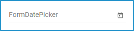
| Default Date | By default the field is empty. Use the calendar  Image Added in the element or in the Attributes panel to preset a date: Image Added in the element or in the Attributes panel to preset a date: Image Added Save your default date by clicking on the check button. The set date and time are displayed in the element: Image Added | - | false | User can enter values (default). |
| Date Format | Use this field to define the format, in which the date shall be displayed. You can choose between three date formats. | DD.MM.YYYY | Date is displayed in order day-month-year (default).
Example: 31.12.2099 |
| MM.DD.YYYY | Date is displayed in order month-day-year.
Example: 12.31.2099 |
| YYYY.MM.DD | Date is displayed in order year-month-day.
Example: 2099.12.31 | Default Date | By default the field is empty. Use the calendarImage Removed in the element or in the Attributes panel to preset a date:
Image Removed
Save your default date by clicking on the check button. The set date and time are displayed in the element: | Image Removed
- |
| Use Current Date | The current date and time is used. | Info |
|---|
If Use Current Date is enabled, you cannot use the calendar (attribute Default Date) any more. |
| true | The current date is displayed. |
| false | The entered date is displayed. |
| Vertical Alignment | | Multiexcerpt include |
|---|
| SpaceWithExcerpt | INTERNAL |
|---|
| MultiExcerptName | form_elements_vertical_alignment |
|---|
| PageWithExcerpt | INTERNAL:_designer_excerpts |
|---|
|
| Top | | Multiexcerpt include |
|---|
| SpaceWithExcerpt | INTERNAL |
|---|
| MultiExcerptName | form_elements_vertical_alignment_top |
|---|
| PageWithExcerpt | INTERNAL:_designer_excerpts |
|---|
|
|
| Center | | Multiexcerpt include |
|---|
| SpaceWithExcerpt | INTERNAL |
|---|
| MultiExcerptName | form_elements_vertical_alignment_center |
|---|
| PageWithExcerpt | INTERNAL:_designer_excerpts |
|---|
|
|
| Bottom | | Multiexcerpt include |
|---|
| SpaceWithExcerpt | INTERNAL |
|---|
| MultiExcerptName | form_elements_vertical_alignment_bottom |
|---|
| PageWithExcerpt | INTERNAL:_designer_excerpts |
|---|
|
|
| CSS Class | Enables a field-acurate layout customization. | A valid CSS class. |
| Symbol Type | Displays the type of the form element in read-only mode. | _ |
| | Multiexcerpt include |
|---|
| SpaceWithExcerpt | INTERNAL |
|---|
| MultiExcerptName | form_elements_cssClass |
|---|
| PageWithExcerpt | INTERNAL:_designer_excerpts |
|---|
|
| | Multiexcerpt include |
|---|
| SpaceWithExcerpt | INTERNAL |
|---|
| MultiExcerptName | form_elements_cssClass_value |
|---|
| PageWithExcerpt | INTERNAL:_designer_excerpts |
|---|
|
|
Custom Attributes
| | Multiexcerpt include |
|---|
| SpaceWithExcerpt | INTERNAL |
|---|
| MultiExcerptName | form_elements_customerAttributes |
|---|
| PageWithExcerpt | INTERNAL:_designer_excerpts |
|---|
|
| | Multiexcerpt include |
|---|
| SpaceWithExcerpt | INTERNAL |
|---|
| MultiExcerptName | form_elements_customerAttributes_values |
|---|
| PageWithExcerpt | INTERNAL:_designer_excerpts |
|---|
|
|
| Symbol Type | | Multiexcerpt include |
|---|
| SpaceWithExcerpt | INTERNAL |
|---|
| MultiExcerptName | form_elements_symbolType |
|---|
| PageWithExcerpt | INTERNAL:_designer_excerpts |
|---|
|
| _ |