Step 2: Designing the Forms
Follow Our Example User Story
David starts with designing a form to collect the order data. He needs the following data items:
vendor ID
vendor name
item
quantity
price
He also designs a form for the supervisor who can still release the order if the order limit is exceeded and a message for each result of the order check: approval or rejection.
Design a Form to Enter the Order Details
In folder Forms, create a new form Form_EnterWebOrder:
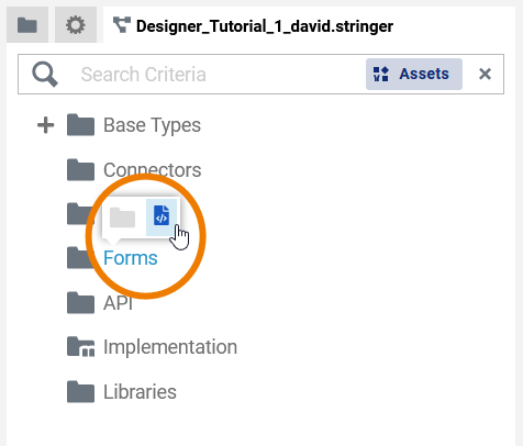
If you want to create new items in the Service Panel just hover over a folder (or its contents) and use the icons in the pop-up menu. To open the context menu of an item, right-click it in the tree.
The newly created form opens in a separate form editor tab:
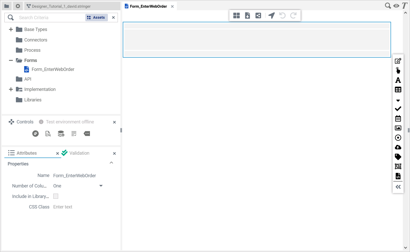
For more information on the form editor in general, e.g. an explanation of all window elements and features, refer to Working with the Form Editor in the Designer Guide.
Create a Rough Sketch
You are going to design a form like this one:
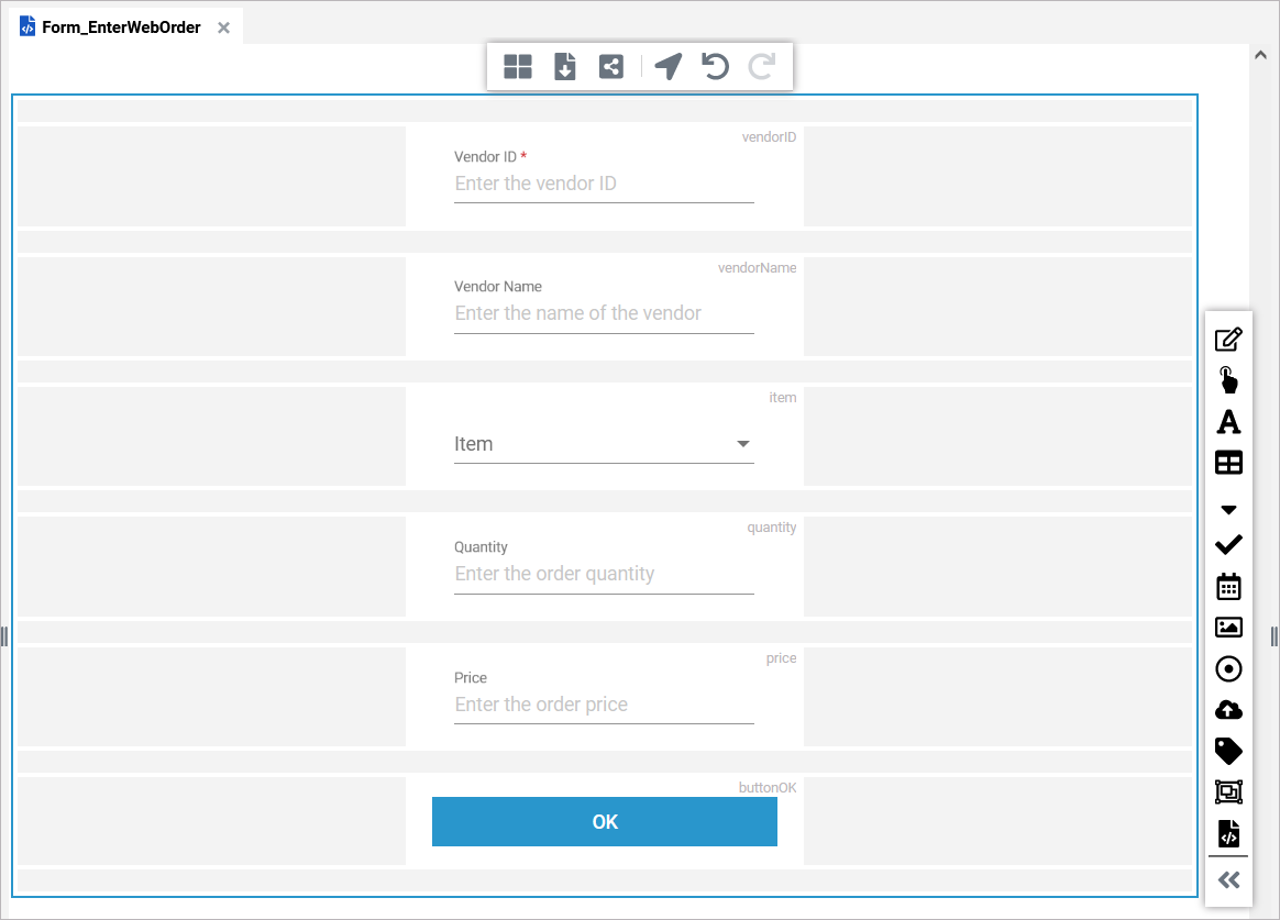
Find a detailed description of all available form elements on Supported Form Elements in the Designer Guide.
It looks nicer if all elements are placed in the center of the form with spacing left and right. So before starting to design the actual form, change the layout of the form. Choose icon Column Layout from the toolbar of the form editor:

Select a three-column layout:

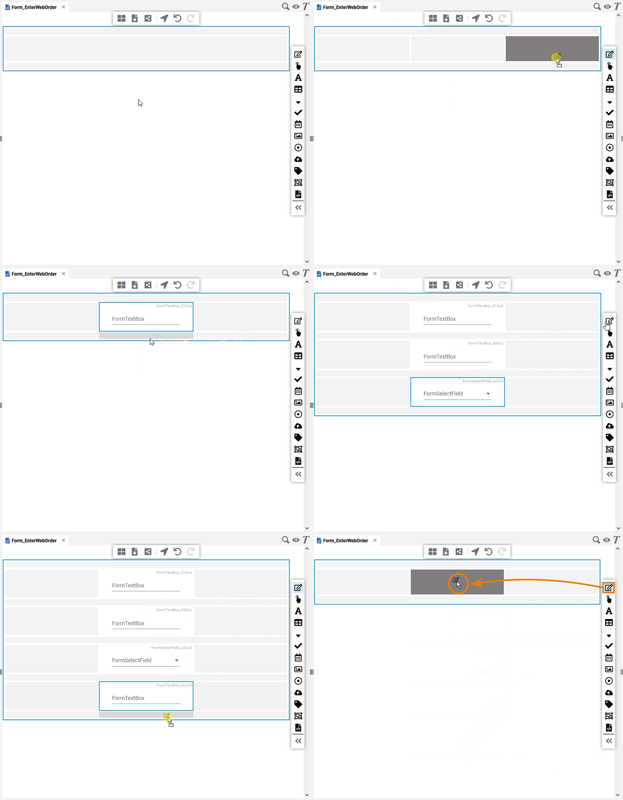
Now, start dragging form elements from the sidebar of the form editor to the center column of your layout.
You need (from top to bottom)
two text boxes
a select field
two text boxes again
a button
Click on the image to run through the animated version once. Click again to repeat.
Specify the Details of the Form Elements
In a second step, you need to rework the form elements: Give them meaningful names and labels, fill in some data for the select field, check some field values.
It is important to add meaningful names, because you will need to refer to these names later when implementing the process.
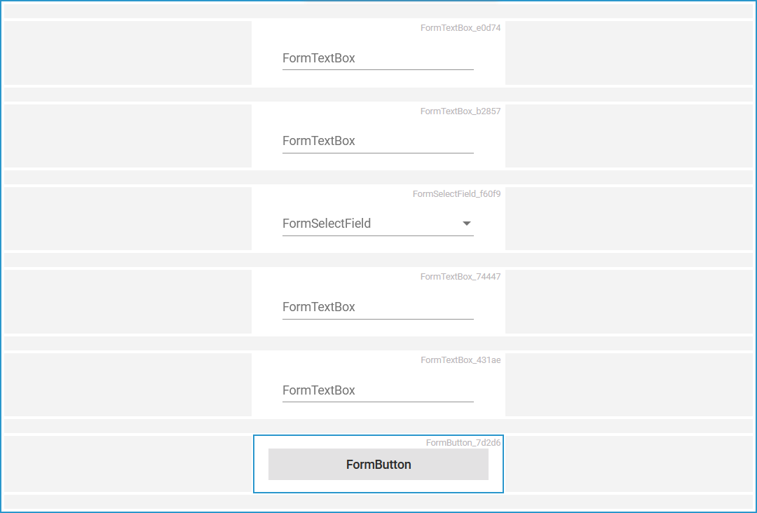
Select the topmost text box and have a look at the Attributes panel. You can find it in the bottom left of the form editor.
Designer panels can be moved and hidden. If you do not see the Attributes panel, click on the user icon in the top right corner, open the User Preferences. In the user preferences, select Reset Panels.
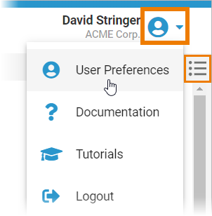
The icons of hidden panels are displayed in the top right corner of the editor.
You can also click the attributes panel icon here to display the panel again.
Double-click the highlighted attributes and enter the following:
Name: vendorID
Label: Vendor ID
Mandatory: True
Placeholder: Enter the vendor ID
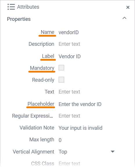
The Name of the text box will be used in the BPMN process later on to access the data of that text box. The Label and the Placeholder text will be displayed on the form to guide the user as to what he should enter when filling in the form.
Now enter Name, Label, and Placeholder for all other form elements:
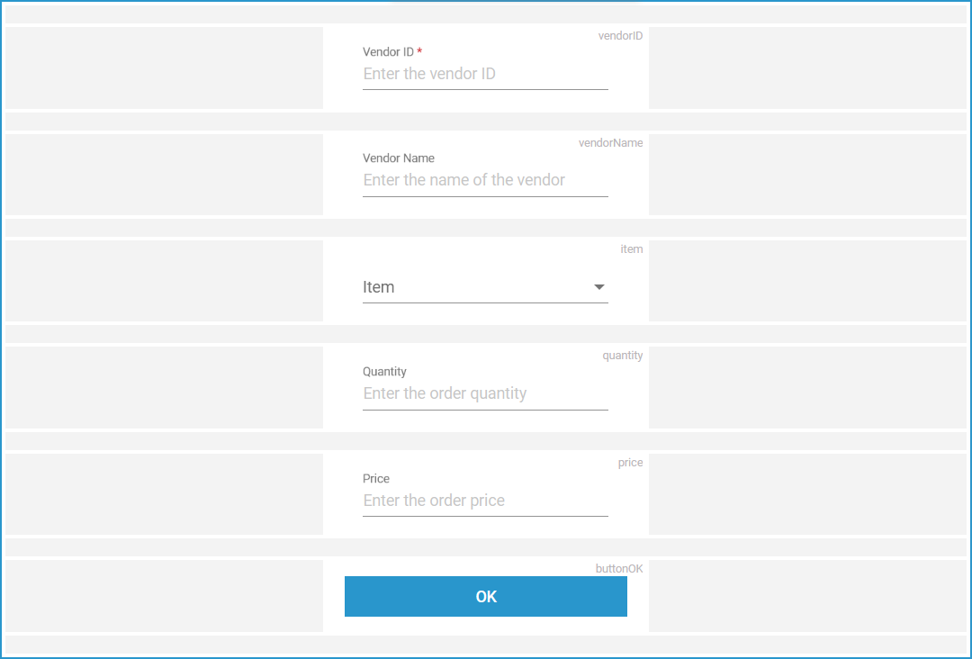
Form Element Name | Attributes Content |
|---|---|
buttonOK |
|
item |
|
price |
|
quantity |
|
vendorID | See above. |
vendorName |
|
Add Validation to Some Form Elements
Besides that they are mandatory, some fields need additional validation: The vendorID needs to be a number as well as the input of quantity and price. The price also may contain decimal places.
The input data of text boxes can be validated using a Regular Expression. You can also enter a Validation Note to inform the user about the valid entries:
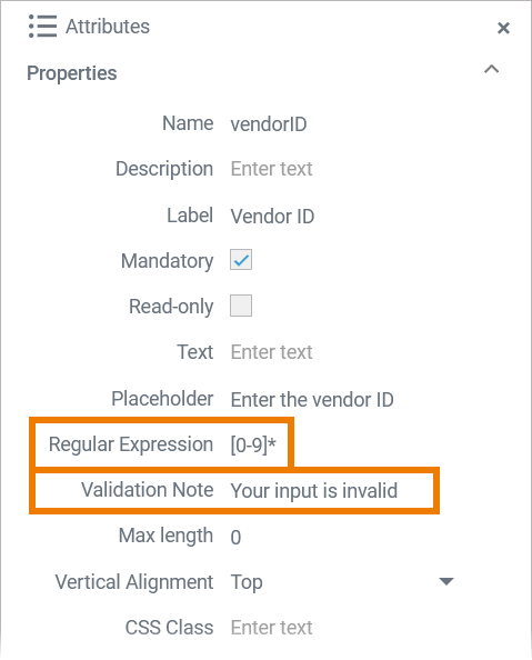
Enter regular expressions and corresponding validation notes to the text boxes as listed below:
Form Element Name | Attributes Content |
|---|---|
vendorID |
|
quantity |
|
price |
|
Refer to Validating Form Fields in the Designer Guide for more detailed information about form field validation.
Populate the Items List
Finally, you are going to provide some order items to select from.
Select form element Item and switch to the Attributes panel. Attribute Options defines available options. Initially there are none. Open the select field configuration to edit the options:
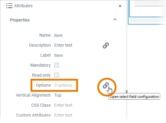
Enter some item data like listed below:
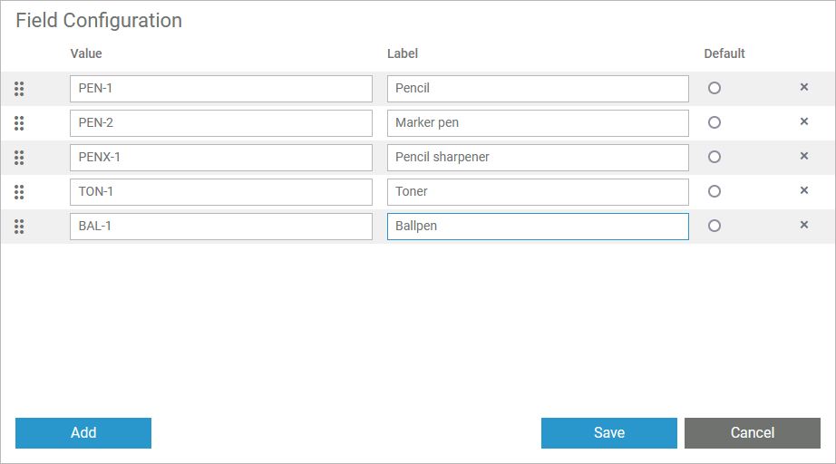
Value | Label |
|---|---|
PEN-1 | Pencil |
PEN-2 | Marker pen |
PENX-1 | Pencil sharpener |
TON-1 | Toner |
BAL-1 | Ballpen |
Design "Form_CheckOrder" for the Supervisor
To give the supervisor the opportunity to manually review and - if necessary - to approve an order that exceeds the limit, go to the Service Panel and create the additional form Form_CheckOrder. Switch to a three-column layout again and start dragging form elements to the center column of your layout.
You need (from top to bottom):
one label element
two text boxes
another label element
a grouping element with attribute Number of Colums: Two
two buttons within the grouping element
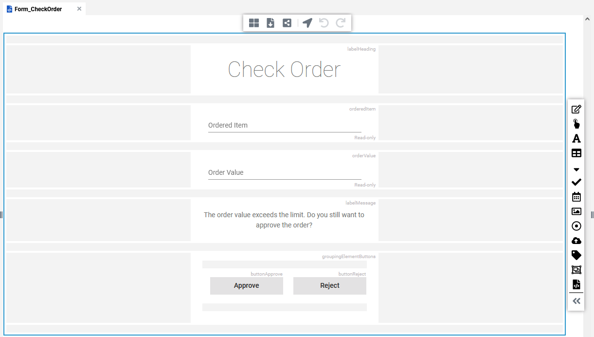
Use the first label element as header for your form. You can apply styling to a label via attribute Style: Select the label and go to the Attributes panel. Open the styling dialog with a click on option Open the label style dialog of attibute Style:
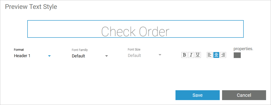
Apply the following styles:
Form Element | Attributes Content |
|---|---|
labelHeading |
|
To change the color of an element, click the colored square, and select a color or enter a color code.
For the two text boxes, enter content in the attributes Name, Label, and set Read-only:
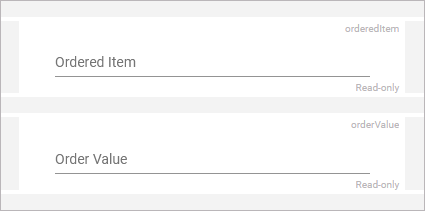
Form Element | Attributes Content |
|---|---|
orderedItem |
|
orderedValue |
|
Adjust the second label element as follows:
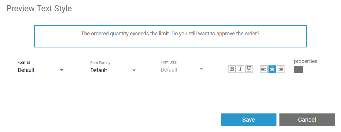
Form Element | Attributes Content |
|---|---|
labelMessage |
|
Format the grouping element and its content as follows:
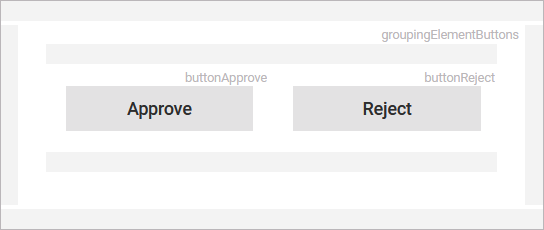
Form Element | Attributes Content |
|---|---|
groupingElementButtons |
|
buttonApprove |
|
buttonReject |
|
Design the Message Forms
To show the outcome of the validation, go to the service panel and create two additional forms:
Form_EndApproved
Form_EndRejected
Form_EndApproved
Open Form_EndApproved. Choose a three-column layout, and add
a label
a button
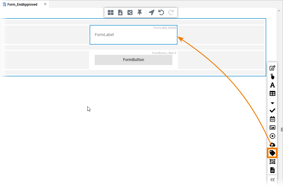
Apply the following to the form elements in the Attributes panel:
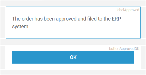
Form Element | Attributes Content |
|---|---|
labelApproved |
|
buttonApprovedOK |
|
Select the label and open its styling dialog. Apply the following styling:
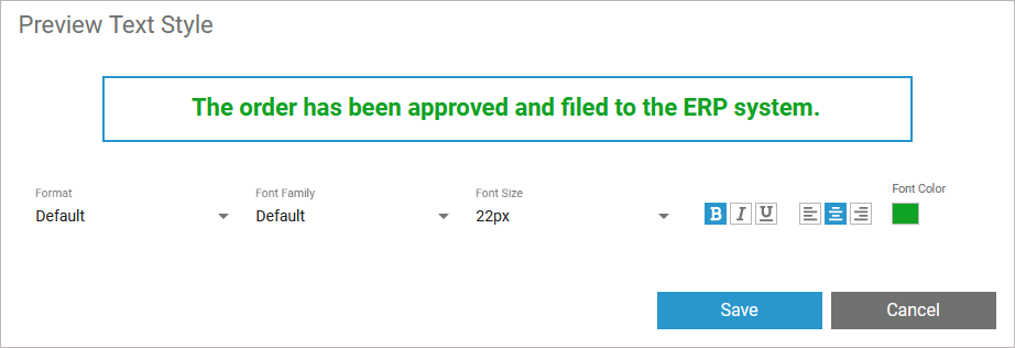
Form Element | Attributes Content |
|---|---|
labelApproved |
|
Form_EndRejected
Switch to the form you created for the rejection message, and define the form as shown below in the same way:

You have now drawn the business process as a BPMN and created forms to enter the necessary process data. In the next step, you must assign the forms to their respective process steps.
